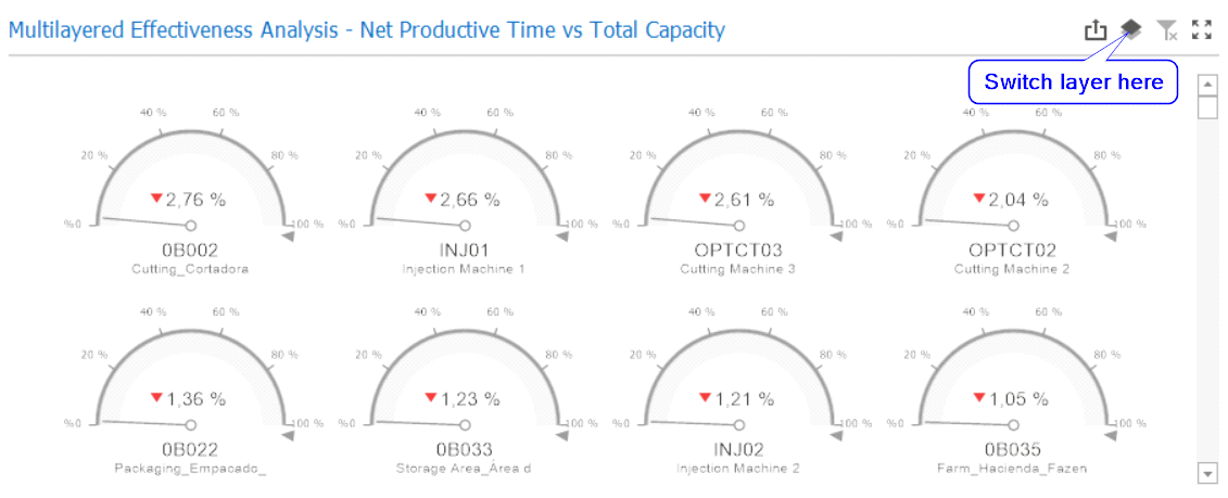
This gauge chart provides three layers for understanding the resources’ effectiveness, which are:
a)Net Productive Time vs Total Capacity: Net Productive Time divided by Total Capacity, without discounting availability losses (this is not the OEE calculation). This layer represents how effective the factory would be if there were no downtimes or setup times in production. A red icon is displayed every time that the Net Productive Time is lower than 70% of the Total Capacity;
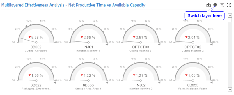
b) Net Productive Time vs Available Capacity: Net Productive Time divided by Available Capacity (AC), resulting in the OEE calculation for each resource. A red icon is displayed every time that the Net Productive Time is lower than 70% of the Available Capacity;
c) Planned Work vs Available Capacity: Planned Work (scheduled production plus executed production) divided by Available Capacity, without discounting quality and performance losses (this is not the OEE calculation). This layer represents how effective the factory would be if there were no losses related to how the production is being executed A red icon will be displayed every time that the Planned Work is lower than 70% of the Available Capacity.
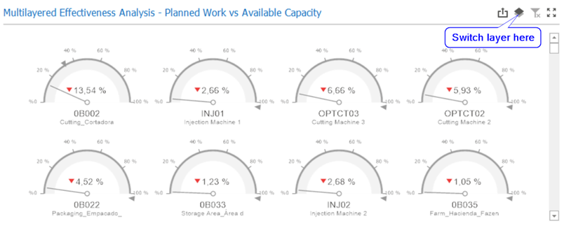
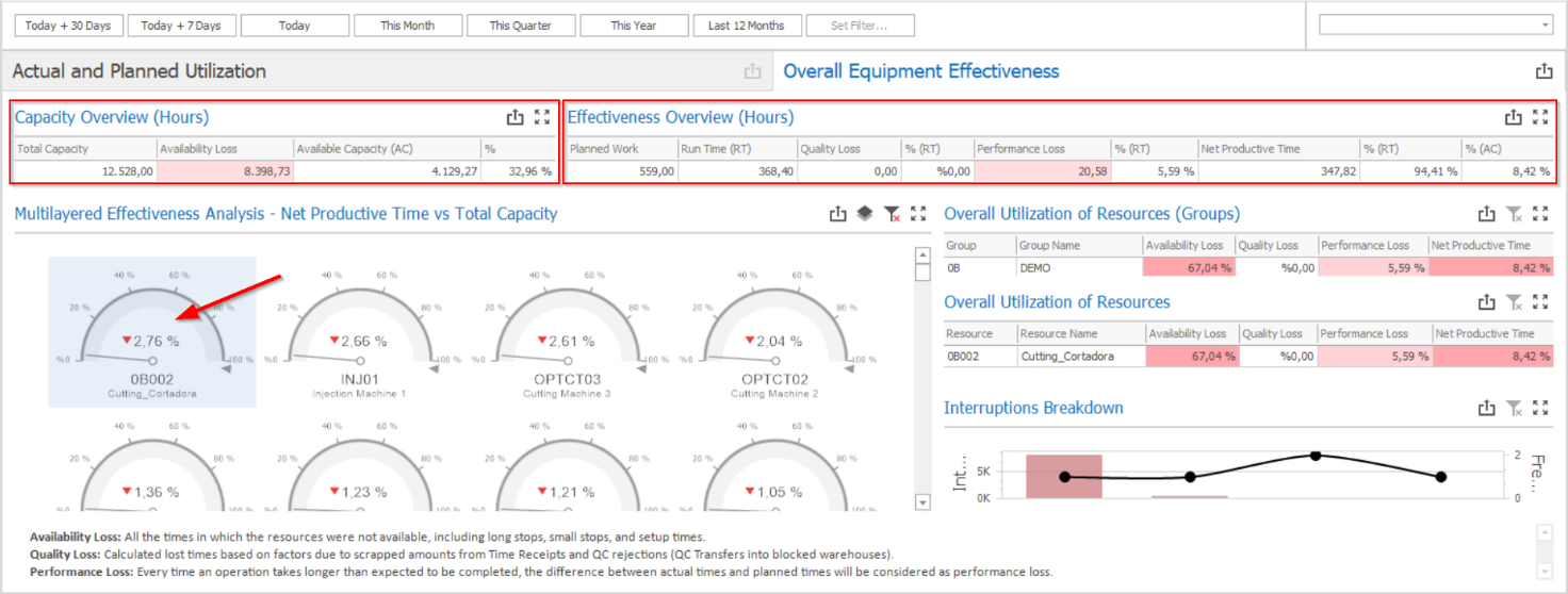
In the Multilayered Effectiveness Analysis chart, the calculations is always represented in percentual values; to know the absolute values corresponding to the percentages of a specific resource, you just need to select the desired resource and check the results on the Capacity Overview (Hours) and the Effectiveness Overview (Hours) grids.