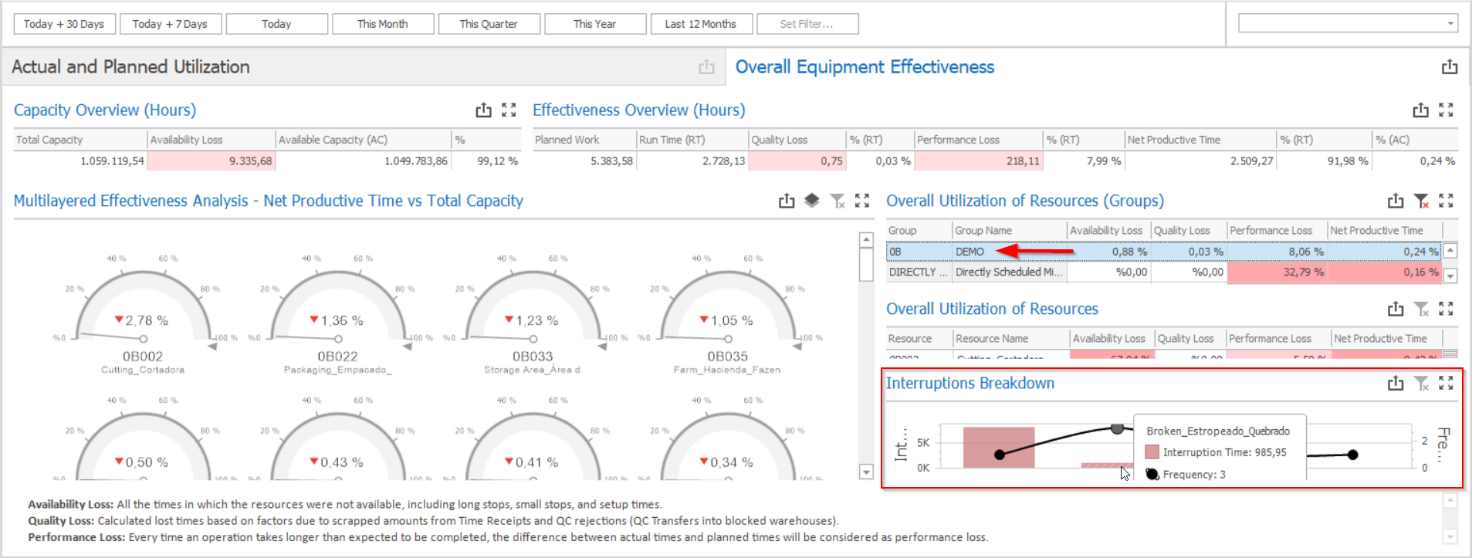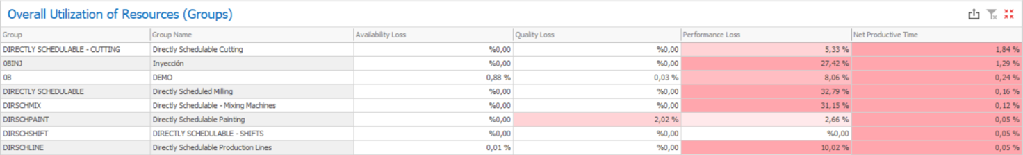
This report details how effective are the different resource groups, revealing the following information:
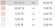
a) Availability Loss: Available Capacity (AC) divided by Total Capacity, resulting in how much of the capacity was lost due to planned or unplanned stops. This column is colored in a red scale to represent how large the availability losses were:
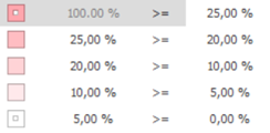
b) Quality Loss: Quality Loss divided by Run Time (RT), resulting in how much of the run time was lost due to bad quality. This column is colored in a red scale to represent how large the quality losses were: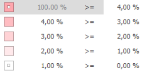
c) Performance Loss: Performance Loss divided by Run Time (RT), resulting in how much of the run time was lost due to underperformance. This column is colored in a red scale to represent how large the performance losses were:
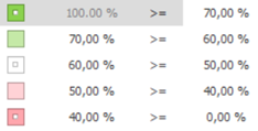
d) Net Productive Time: Net Productive Time divided by Available Capacity (AC), resulting in the OEE calculation for the resource group. This column is colored in a green and red scale to represent how efficient the resources were:
Any resource group can be selected for further insights on how efficient their resources are (triggering filters on the other grids and charts from the dashboard). If you wish to check which interruptions affected the resources within a specific group and how much time was lost for each one of them, you can just click on the desired resource group and check the results under the “Interruptions Breakdown” grid.