Buttons, icons, and right-click entries can be defined in various layouts in the following way:

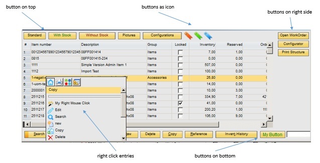
Buttons can be created on top, on the right side, on bottom or via right-click. Furthermore, a function can be linked to the button.
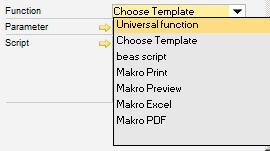
- Select template - Execute print macro (e.g. label printing) - Execute Beas or B1UP Universal function (e.g. lists, reports, or dashboards) - Execute direct scripts (e.g. open window) The function Button Definition can be accessed via:
PATH: Administration > Add-Ons > B1 Usability Package > Module Configuration > Beas Usability Extension: Beas Customizing Administration window > Edit function buttons, - Right-click > Beas Usability Package Setup Overview > New Button. An existing entry can be edited hereafter, *In Boyum Style this icon is:
Window sys_button_edit.psr Add Button 1. Add function buttons – right-click to open window. 2. Button "Add row". 3. Fill in the field "Text" for the button. 4. Select position (top, bottom, right, or right-click). 5. Define functions and associated parameters. 6. Add row. 7. Close the original window and reopen it.
User Specific Definition Several button definitions can be made, e.g. user-specific. See: User. In this way, all active button definitions corresponding to the user rule are considered always. If more than one definition exists, they must be opened via right-click > Beas Usability Package Icon > Setup Overview. There is possibility for further definitions to be made or changed here.
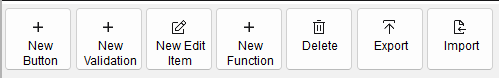
The above tool bar in Boyum Style desgin: |
 /
/  > Beas Usability Extension Overview,
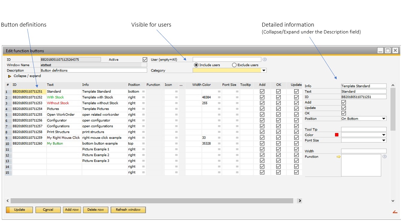
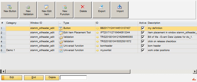
Window sys_trigger_browse.psr
Field |
Description |
|
|---|---|---|
ID |
Unique ID for the function buttons – Definition. If an ID is not set manually, the system assigns one automatically. |
|
Window ID |
ID of the window for which the defined validation should apply. Tip: The window specified here must be open in order to change its properties. |
|
Description |
Text field where the validation can be described in further details. |
|
Active |
The function buttons definition is only considered when this box is checked. |
|
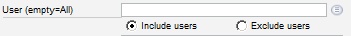
User (empty=All) |
|
|
Category |
Select a category for the function button from drop-down menu. |
Fields to set in the right window section:
Field |
Description |
|||||||||
|---|---|---|---|---|---|---|---|---|---|---|
Info |
Optional information or remarks. |
|||||||||
Text |
Label of the button or text by right-clicking. |
|||||||||
ID |
Unique ID. If an ID is not set manually the system assigns one automatically. |
|||||||||
Add/Update/OK |
Check boxes to define whether the button should be visible in the selected mode. Note: The check only takes place while opening the window. If the mode is changed in the window (e.g. from OK to UPDATE or back), there is no reloading or new validation of the buttons. |
|||||||||
Position |
|
|||||||||
Icon |
|
|||||||||
Tool Tip |
|
|||||||||
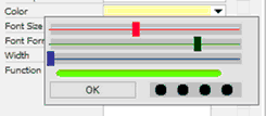
Color |
Defines the font color for the button (not possible for right-click entry). You can select and calibrate color tones with sliding bars: |
|||||||||
Font Size |
Defines the font size for the button (not possible for right-click entry). |
|||||||||
Font Format |
Defines font format (not possible for right-click entry). |
|||||||||
Width |
|
|||||||||
Function Parameter Script |
|