|
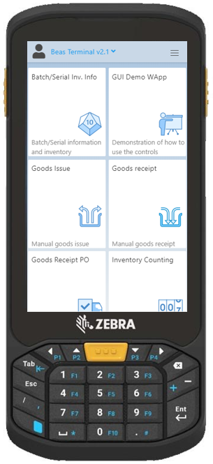
With this app you can gain information on how to use the controls of Terminal 2.1 and create your own Beas WebApps.
Although the app is optimized for the Zebra scanner, it is recommended to use it on larger (tablet size) displays for better readability and perception of topics and examples.
The app consists of three tabs:
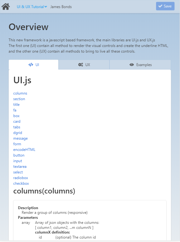
Topic
|
Method
|
columns
|
Description
|
Render a group of columns (responsive).
|
Parameters
|
array
|
Array of json objects with the columns:
[ column1, column2, ...m columnN ]
columnX definition:
ID
|
(optional) The column ID
|
size
|
Size for this column. Available sizes are: 3/4, 2/3, 1/2, 1/3, 1/4, 4/5, 3/5, 2/5, 1/5
|
content
|
The column content
|
|
Return
|
string
|
The HTML to create the columns
|
Example
|
|
> ui.columns( [{size:"1/5",content:"This columns should be 1/5 of the size. (Or all width in a mobile)"},
{size:"3/5",content:"This columns should be 3/5 of the size. (Or all width in a mobile)"},
{size:"1/5", content:"This columns should be 1/5 of the size. (Or all width in a mobile)"}] );
|
Preview:
In the preview of the example you can see how the above string can modify the size of the columns.
|
|
section
|
Description
|
A simple container to divide your page into sections.
|
Parameters
|
string
|
The HTML content
|
object
|
json object with the options:
ID
|
(optional) The control ID
|
hero
|
The section is a hero. (true|false)
|
|
Return
|
string
|
The HTML to create the section
|
Example
|
|
> ui.section( "Put here the content" );
Preview:
In the preview of the example you can see the result of the string:
"Insert content here."
|
|
|
title
|
Description
|
Create a title/subtitle (title/subtitle).
|
Parameters
|
string
|
The HTML content
|
object
|
json object with the options:
type
|
Type of title: (title|subtitle)
|
size
|
The size: (1,2,3,4,5,6,7,8)
|
|
Return
|
string
|
The HTML to render the title
|
Example
|
|
> ui.title( "This is a title" );
Preview:
In the preview of the example you can see the result of the string:
"This is a title."
|
|
|
fa
|
Description
|
Render the HTML to represent a font-aweson icon.
|
Parameters
|
string
|
The icon name (check names here: https://fontawesome.com/icons?d=gallery )
|
string
|
(optional, default:"small") The icon size: small, medium, large, 2x, 3x
|
Return
|
string
|
The HTML to create the icon
|
Example
|
|
> ui.fa( "smile-wink" );
< <span class="icon"><i class="fas fa-smile-wink"><></span>
Preview:
In the preview of the example you can see the result of the string, a wink icon:

|
|
|
box
|
Description
|
A simple box.
|
Parameters
|
string
|
The HTML content
|
object
|
JSON object with the options
ID
|
(optional) The ID for this tab
|
|
Return
|
string
|
The HTML to render the control
|
Example
|
|
> ui.box( "This is the box's content" );
Preview:
In the preview of the example you can see the result of the string:
This is the content of the box.
|
|
|
|
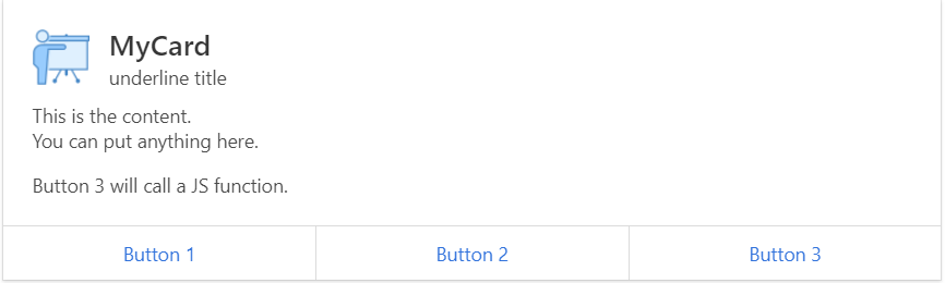
card
|
Description
|
The card component comprises several elements:
•header title, subtitle, icon, image
•content (at this moment all your output after command header until a footer command is executed)
•footer |
Parameters
|
object
|
JSON object with the options
title
|
The tab title
|
subtitle
|
The tab subtitle
|
img1
|
The image next to the title
|
img2
|
The image next to the content
|
content
|
The tab content
|
buttons
|
Array ob json objects with the buttons definition:
title
|
The button title
|
link
|
A link for the button
|
onclick
|
JS to execute onclick
|
|
|
Return
|
string
|
The HTML to render the control
|
Example
|
|
> ui.card( { title:"MyCard",subtitle:"underline title",img1:"assets21/img/app_t20_demo.png", content:"
This is the content.
You can put anything here.
Button 3 will call a JS function.
", buttons:[ {title:"Button 1",link:"#"},{title:"Button 2",link:"#"},{title:"Button 3",link:"", onclick:"alert('JDG::JS-test')"}] });
Preview:
In the preview of the example you can see the result of the string:
|
|
|
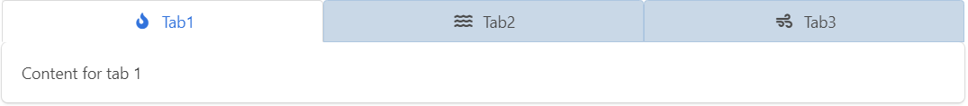
tabs
|
Description
|
Create a tab control.
|
Parameters
|
string
|
The tab ID
|
array
|
An array of json objects with all options to render each tab:
[ tab1, tab2, ..., tabN ]
tabX structure:
ID
|
(optional) The ID for this tab
|
title
|
The tab title
|
icon
|
The tab icon (You can use ui.fa() to render the icon)
|
content
|
The tab content
|
|
Return
|
string
|
The HTML to create the tab
|
Example
|
|
> ui.tabs( "tabExample01", [ {title:"Tab1", icon:ui.fa("fire"), content:"Content for tab 1"}, {title:"Tab2", icon:ui.fa("water")}, {title:"Tab3", icon:ui.fa("wind")}] );
Preview:
In the preview of the example you can see the result of the string:
|
|
|
dgrid
|
Description
|
Create the container to hold a DataGrid.
|
Parameters
|
string
|
The control id
|
Return
|
string
|
The html to contain the control created by the UX library
|
Example
|
|
> ui.dgrid( "gridExample01" );
Preview:
In the preview of the example you can see the result of the string.
|
|
|
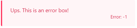
message
|
Description
|
Create a message box.
|
Parameters
|
number
|
The error code. If it is lower than 0 is considered an error
|
string
|
The HTML with the message
|
Return
|
string
|
The HTML to create the control
|
Example
|
|
> ui.message( -1, "Ups. This is an error box!" );
Preview:
|
|
|
form
|
Description
|
Render the html to represent a form.
|
Parameters
|
string
|
The form ID
|
string
|
The action to perform when you submit the form
|
string
|
The content
|
Return
|
string
|
The HTML to create the form
|
Example
|
|
> ui.form( "formExample", "?page=myApp", html_with_the_content );
<
html_with_the_content
|
|
|
encodeHTML
|
Description
Encode a string to be used as value in a HTML tag.
Parameters
string The string to be encoded.
Return
void
Example
> ui.encodeHTML( "This & this " );
< This & this <is a test>
|
|
button
|
Description
|
Render the HTML to represent a button.
|
Parameters
|
string
|
The control ID
|
string
|
The title of the control
|
options
|
json object with all options to render the control:
link
|
Define the target URL for this button
|
type
|
Define the type applied to the button
|
licon
|
Define the left icon displayed into the button (You can use a fontaweson name)
|
readonly
|
Define the control as read-only
|
disabled
|
Define the control as disabled
|
|
Return
|
string
|
The HTML to create the control
|
Example
|
|
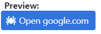
> ui.button( "buttonExample01", "Open google.com", {type:"is-link", link:"https://www.google.com", licon:"spider"} );
Preview:
In the preview of the example you can see the result of the string:
|
|
|
input
|
Description
|
Render the HTML to represent an input box.
|
Parameters
|
string
|
The control's label
|
string
|
The control's name
|
string
|
The control's default value
|
options
|
json object with all options to render the control:
type
|
Define the type of the input box, default is text. (hidden|text|number|date)
|
placeholder
|
Define the placeholder for the input, by default the control's tittle is used to.
|
licon
|
Define the left icon displayed into the button (You can use a fontawesome name)
|
ricon
|
Define the right icon displayed into the button (You can use a fontawesome name)
|
lbutton
|
The field has an action button at the left side like an option icon
|
rbutton
|
The field has an action button at the right side like a search icon
|
readonly
|
Define the control as read-only
|
disabled
|
Define the control as disabled
|
error
|
Error if the user has selected nothing
|
|
Return
|
string
|
The HTML to create the control
|
Example
|
|
> ui.input( "User Name", "name", "", {placeholder:"Type your name", licon:"fa-user", rbutton:"fa-search" } );
Preview:
In the preview of the example you can see the result of the string:

|
|
|
textarea
|
Description
|
Render the HTML to represent an text area box.
|
Parameters
|
string
|
The control's label
|
string
|
The control's name
|
string
|
The control's default value
|
options
|
json object with all options to render the control:
placeholder
|
Define the placeholder for the input, by default the control's tittle is used to.
|
readonly
|
Define the control as read-only
|
disabled
|
Define the control as disabled
|
error
|
Error if the user has selected nothing
|
|
Return
|
string
|
The HTML to create the control
|
Example
|
|
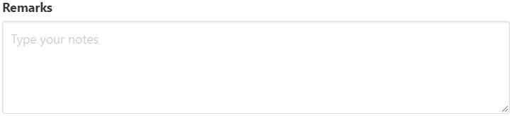
> ui.textarea( "Remarks", "notes", "", {placeholder:"Type your notes"} );
Preview:
In the preview of the example you can see the result of the string:
|
|
|
select
|
Description
|
Render the HTML to represent an select box (dropdown).
|
Parameters
|
string
|
The control's label
|
string
|
The control's name
|
string
|
The control's default value
|
array
|
[ [key1,value1], ..., [keyN,valueN] ]
|
options
|
json object with all options to render the control:
licon
|
Define the left icon displayed into the button (You can use a fontawesome name with the prefix "fa-")
|
readonly
|
Define the control as read-only
|
disabled
|
Define the control as disabled
|
error
|
Error if the user has selected nothing
|
|
Return
|
string
|
The HTML to create the control
|
Example
|
|
> ui.select( "Choose an option", "select-example", "", [[1,"Option 1"],[2,"Option 2"],[3,"Option 3"]], {licon:"fa-bolt"} );
Preview:
In the preview of the example you can see the result of the string:

|
|
|
radiobox
|
Description
|
Render the HTML to represent a group of excluding options (radio-box).
|
Parameters
|
string
|
The control's name
|
string
|
The control's default value
|
array
|
[ [key1,value1], ..., [keyN,valueN] ]
|
options
|
json object with all options to render the control:
readonly
|
Define the control as read-only
|
disabled
|
Define the control as disabled
|
|
Return
|
string
|
The HTML to create the control
|
Example
|
|
> ui.radiobox( "radiobox-example", "", [[1,"Option 1"],[2,"Option 2"],[3,"Option 3"]], {licon:"fa-bolt"} );
Preview:

|
|
|
checkbox
|
Description
|
Render the HTML to represent a group of options (check box).
|
Parameters
|
string
|
The control's name
|
string
|
The control's default value
|
array
|
[ [key1,value1], ..., [keyN,valueN] ]
|
options
|
json object with all options to render the control:
readonly
|
Define the control as read-only
|
disabled
|
Define the control as disabled
|
|
Return
|
string
|
The html to create the control
|
Example
|
|
> ui.checkbox( "Do you like our new framework?", "checkbox-example", true );
Preview:
In the preview of the example you can see the result of the string:

|
|
|
more
|
Description
|
Render a line with more information collapsed.
|
Parameters
|
string
|
The title of the control
|
string
|
The content of the control
|
Return
|
string
|
The html to create the control
|
Example
|
|
> ui.more( "Click here to expand the information", "This is the information
inside of this control
Hello!!" );
Preview:
In the preview of the example you can see the result of the string - a link appears:
Click here to expand the information
- By clicking the link in the app, you can test how the information is expanded. You can close the displayed message box by tapping the "Close" button in the right top corner of the box.
|
|
|
|
Topic
|
Method
|
click
|
Description
|
A wrapper for the listen function.
|
Parameters
|
string
|
The element ID to add the onclick event
|
function
|
The function to trigger on the event
|
Return
|
|
No return value
|
Example
|
|
<span id="click-example">Try to click me</span>
<script>ux.click("click-example",function(){alert("Not so strong! XD");});</script>
Preview:
In the preview of the example you can see the result of the string:
A click function is displayed: "Try to click me". When clicking the function, a message appears in a separate box which you can close with "OK".
|
|
|
listen
|
Description
|
Listen on the element ID for the event name and then trigger the function given
|
Parameters
|
string
|
The event to listen
|
string
|
The element ID to watch
|
function
|
The function to trigger on the event
|
Return
|
|
No return value
|
Example
|
|
<span id="listen-example">Try to pass over me</span>
<script>
ux.listen("mouseover","listen-example",function(){this.className='has-background-danger';});
ux.listen("mouseout","listen-example",function(){this.className='';});
</script>
Preview:
In the preview of the example you can see the result of the string:
A function to trigger an event appears: "Try to pass over me". When you hover over the line, it is highlighted wit red until you keep the mouse over it.
|
|
|
getElement
|
Description
|
Search an element by ID or Name
|
Parameters
|
string
|
The element ID or name
|
Return
|
|
The element if it is found or null
|
Example
|
|
<input id="getElement-exampleID" name="getElement-exampleName">
<input type="button" value="Example 1" onclick="ux.getElement('getElement-exampleID').value = 'By ID';">
<input type="button" value="Example 2" onclick="ux.getElement('getElement-exampleName').value = 'By Name';">
Preview:
In the preview of the example you can see the result of the string:

|
|
|
loading
|
Description
|
Show a loading mask to avoid the user click on any control
|
Parameters
|
boolean
|
Activate o DeActivate the loading mask
|
Return
|
|
No return value
|
Example
|
|
<a href="#" onclick="loading_example()">Click here</a> to display the loading mask for 5 seconds
<script>
function loading_example() {
ux.loading(true);
setTimeout(function(){ ux.loading(false); }, 5000); }
</script>
Preview:
In the preview of the example you can see the result of the string:
By clicking the link in the "Click here to display the loading mask for 5 seconds" message, the app displays the loading mask for 5 seconds.
|
|
|
dialog
|
Description
|
A modal dialog box
|
Parameters
|
string
|
The title
|
string
|
The HTML content
|
object
|
json object with all options to render the control:
icon
|
An icon to show in the message
|
buttons
|
Array of objects with the definitons of the buttons
( id, title, type [is-success/is-info/is-warning/is-danger]] )
|
|
function
|
Function to call when the dialog is closed or a button is pressed
The pressed button id is sent as parameter (or null if closed without press any button)
|
Return
|
|
No return value
|
Example
|
|
<a href="#" onclick="dialog_example()">Click here</a> to display a modal dialog
<script>
function dialog_example() {
ux.dialog("UX Tutorial","This is a dialog.<br> Do you like it?", {buttons:[ {id:'Y', title:'Yes'},{id:'SY',title:'SUper Yes'}]}, function(b) { alert('You pressed the button with id: '+b); } );
}
</script>
Preview:
In the preview of the example you can see the result of the string:
"Click here to display a modal dialog box."
- by clicking the link in the preview, a dialog box to opens for testing:
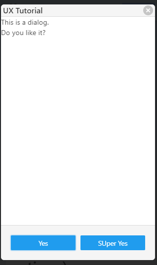
|
|
|
set
|
Description
|
Provide a visual feedback to the input controls
|
Parameters
|
string
|
The control's id or name
|
string
|
The new status: show|hide|readonly|disabled|error|title|subtitle|clear
|
object
|
json object with all options
buttons
|
Apply the status to the attached buttons ( true|false)
|
bX
|
Apply the status to the attached button number X( true|false)
|
|
Return
|
object
|
The element
|
Example
|
|
<div id="set-example" class="preview"></div>
<script>
document.getElementById("set-example").innerHTML = ui.input( "User Name", "name", "", {placeholder:"Type your name", licon:"fa-user", rbutton:"fa-search" } )
+ ui.button( "set01", "set Error", {type:"is-link", link:"javascript:set01()", licon:"error"} )
+ ui.button( "set02", "set Disabled", {type:"is-link", link:"javascript:set02()", licon:"eye"} )
+ ui.button( "set03", "set Clear", {type:"is-link", link:"javascript:set03()", licon:"clean"} ) ;
function set01() { ux.set("set-example","error"); }
function set02() { ux.set("set-example","disabled"); }
function set03() { ux.set("set-example","clear"); }
</script>
Preview:
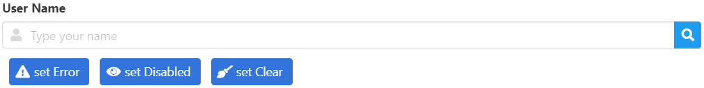
|
|
|
tabs
|
Description
|
Add functionality to ui.tabs
|
Parameters
|
string
|
The control's ID or name
|
string
|
The command: init|active
|
object
|
The params depend of the command:
action=init
|
set params to null to init all tabs or set an id to init only the specified one
|
action=active
|
set the name of the tab to activate
|
|
Return
|
void
|
|
Example
|
|
document.getElementById("your-container").innerHTML = ui.tabs( "tabExample01ux", [ {title:"Tab1", icon:ui.fa("fire"), content:"Content for tab 1"}, {title:"Tab2", icon:ui.fa("water")}, {title:"Tab3", icon:ui.fa("wind")}] ); ux.tabs("tabExample01ux","init");
Preview:
In the preview of the example you can see the result of the string:

|
|
|
dgrid
|
Description
|
Create a functional data grid and fill it with data from a valid oData source
|
Parameters
|
string
|
The control's ID
|
object
|
JSON object with the options to create the grid:
fields
|
Array of field: [ field1, field2, ..., fieldN ]
Field structure:
title
|
The title of the field
|
sort_key
|
Name of the field if it's possible to be sorted by this field
|
align
|
left|center|right
|
hidden
|
true|false
|
type
|
text|number|date|time|datetime|boolean
|
width
|
Set the width for this field
|
ondraw
|
Function with the value of the current field and you must return the html to draw this cell
|
|
rows
|
(It will be fill up using the url). Array of Array with the rows data: [ [row1_col1,row1_col2,...,row1_colN], ..., [rowN_col1,...,rowN_colN]]
|
URL
|
string with the url to get the data (oData or beas generated dgrid data)
|
sort_key
|
string with the name of the field to sort the result
|
sort_dir
|
Set order to (asc)ending or (desc)ending. Default: asc
|
onclick_row
|
function to be executed when the user select a row, the row's data is passed as argument
|
limit
|
Set the maximum number of rows to retrieve at time. Default: 25
|
|
Return
|
void
|
|
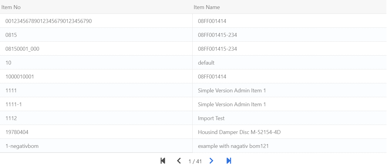
Example 01 (using Beas Service Layer)
|
|
// Create the container
document.getElementById("ux-dgrid-example").innerHTML = ui.dgrid( "ux-dgrid" );
// Initialize the datagrid
ux.dgrid('ux-dgrid', { limit:10
,fields:[ {title:_t("Item No"), sort_key:'ItemCode'},{title:_t("Item Name"), sort_key:'ItemName'} ]
,url:'/odata4/v1/Item?$ProgramId='+appInfo.gid+'&$AppId='+appInfo.appID+'&$format=jsonarray&$inlinecount=allpages&$transaction=receipt&$orderby=ItemCode&$select=ItemCode,ItemName'
,onclick_row:function(d,rid) { console.log('Data in Row selected: ',d); }
}
);
// Later, we can set a new url with a filter
// ux.dgrid('ux-dgrid').url = **we can reset the url with a filter if we want**
// And reload the page(x)
ux.dgrid('ux-dgrid').page(1);
Preview:
In the preview of the example you can see the result of the string:
|
Example 02 (using your own query)
|
|
// You must include this piece of beas script code at top of your beas web app:
// begin beas script code
// -------------------------------------------------------
if <get> = 'dgrid02' then
shtml.web.responseType=json
get_dgrid02()
return success
end if
// -------------------------------------------------------
function get_dgrid02
if <var:sort_by> in {ItemCode,ItemName} then
// ... field valid to sort
else
setvar=sort_by=ItemCode
setvar=sort_dir=ASC
end if
if <var:sort_dir> in {desc,asc} then
// ... sort direction is valid
else
setvar=sort_dir=ASC
end if
setvar=ls_sql= "ItemCode", "ItemName" from "OITM" ORDER BY <sort_by,dbstring> <sort_dir>
shtml.web.dgrid=sql,<dg_page>,<dg_limit>,select <ls_sql>
end function
// -------------------------------------------------------
// end beas script code
// Create the container
document.getElementById("ux-dgrid-example02").innerHTML = ui.dgrid( "ux-dgrid02" );
// Initialize the datagrid
ux.dgrid('ux-dgrid02', { limit:10
,fields:[ {title:_t("Item No"), sort_key:'ItemCode'},{title:_t("Item Name"), sort_key:'ItemName'} ]
,url:'?program_id='+appInfo.gid+'&page=t20_demo&get=dgrid02'
,onclick_row:function(d,rid) { console.log('Data in Row selected: ',d); }
}
);
ux.dgrid('ux-dgrid02').page(1);
Preview:
In the preview of the example you can see the result of the string:
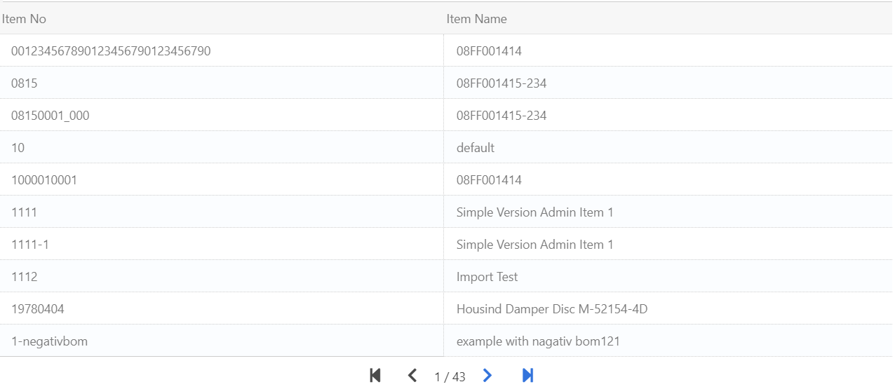
|
|
|
autocomplete
|
Description
|
Add auto-complete functionality to any input box.
|
Parameters
|
string
|
The control's ID
|
string
|
The URL to fetch the data (the value of the filter must be *q* this function will replace it later by the current value)
|
object
|
JSON object with the options to create the auto-completion component:
ondraw
|
Function with the value of the current field and you must return the HTML to draw this cell
|
|
Return
|
void
|
|
Example
|
|
// Create the container
document.getElementById("ux-autocomplete-example01").innerHTML = ui.input( "ItemCode", "ux-autocomplete-cexample01", "", {placeholder:"Type an ItemCode or Name", licon:"fa-search" } );
ux.autocomplete('ux-autocomplete-cexample01', '?program_id='+appInfo.gid+'&page=t20_demo&get=dgrid02&q=*q*');
Preview: (Try to type some "ItemCode" or "ItemName" existing in your database)
In the preview of the example you can see the result of the string:
Start typing an ItemCode or ItemName from your existing database, and a list containing the data will be prompted as below:
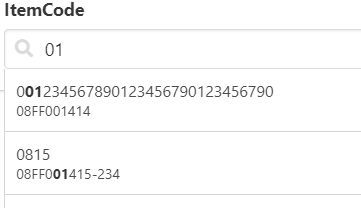
|
|
|
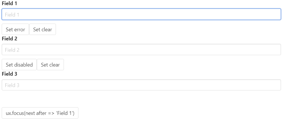
focus
|
Description
|
You can set the focus to a selected field with rules.
Giving a list of controls as an array and the name of a target control:
If the target control has error, we set the focus to this control, otherwise we should set the focus to the next non-disabled field in the list.
|
Parameters
|
array
|
array of controls ordered to be focused
|
string
|
current focused control
|
Return
|
void
|
|
Example
|
|
// Create three fields
document.getElementById("ux-focus-example01").innerHTML =
ui.input( "Field 1", "ux-focus01", "" )
+ui.button("ux-focus01b1","Set error",{link:"javascript:ux.set('ux-focus01','error')"})
+ui.button("ux-focus01b2","Set clear",{link:"javascript:ux.set('ux-focus01','clear')"})
+'<br>'
+ui.input( "Field 2", "ux-focus02", "" )
+ui.button("ux-focus02b1","Set disabled",{link:"javascript:ux.set('ux-focus02','disabled')"})
+ui.button("ux-focus02b2","Set clear",{link:"javascript:ux.set('ux-focus02','clear')"})
+'<br>'
+ui.input( "Field 3", "ux-focus03", "" )
+'<br>'
+'<br>'
+ui.button("ux-focus01b1","ux.focus(next after =<br> 'Field 1')",{link:"javascript:ux.focus(['ux-focus01','ux-focus02','ux-focus03'],'ux-focus01')"});
Preview: (Try to set error/disable and then click Set Focus)
In the Preview section of the example you can try using the button controls "Set error" and "Set clear"
|
|
|
saveAll
|
Description
|
Send data to the backend and block the app in the meanwhile. It switch the "Save" button to "Saving" also.
|
Parameters
|
string
|
URL
|
object
|
JSON object with the parameters to send
|
function
|
Callback function to execute after the command receives a reply.
|
object
|
JSON object with the options:
contentType
|
json|multipart|standard
|
timeout
|
Max time to wait a reply
|
loading
|
Block the app while sending/receiving data. Default: true
|
|
Return
|
void
|
|
Example
|
|
ux.saveAll( '/odata4/v1/issue?$ProgramId='+appInfo.gid+'&$AppId='+appInfo.appID
, json_with_all_data_to_send
, function(err, result) {
if ( !err /* && result hasn't errors */ ) {
ux.dialog(_t("Data saved!"),msg, { buttons:[{id:'ok', title:_t("Ok"),type:"is-success"}] }
, function(){
// Reset here the app
}.bind(this)
);
} else {
ux.dialog(_t("Error"),_t("An unknown error happened. Please wait some seconds and try again."), { buttons:[{id:'ok', title:_t("Ok"),type:"is-danger"}] } );
ux.loading(false);
}
}.bind(this)
, {contentType:'json',timeout:180000}
);
No Preview available
|
|
|
aget
|
Description
|
A wrapper for ux.ajax (GET)
|
Parameters
|
string
|
URL to load
|
function
|
Callback function to execute after the command receive a reply
|
object
|
JSON object with the options:
contentType
|
json|multipart|standard
|
timeout
|
Max time to wait a reply
|
loading
|
Block the app while sending/receiving data. Default: true
|
|
Return
|
void
|
|
Example
|
|
ux.aget( 'http://www.google.es'
, function(err, result) {
if ( !err /* && result hasn't errors */ ) {
ux.dialog(_t("Received!"),result, { buttons:[{id:'ok', title:_t("Ok"),type:"is-success"}] } );
} else {
ux.dialog(_t("Error"),_t("An unknown error happened. Please wait some seconds and try again."), { buttons:[{id:'ok', title:_t("Ok"),type:"is-danger"}] } );
ux.loading(false);
}
}
);
No Preview available
"Push to execute" - a link appears to execute a command.
|
|
|
apost
|
Description
|
A wrapper for ux.ajax (POST)
|
Parameters
|
string
|
URL to load
|
object
|
JSON object with the parameters to send
|
function
|
Callback function to execute after the command receive a reply
|
object
|
JSON object with the options:
contentType
|
json|multipart|standard
|
timeout
|
Max time to wait a reply
|
loading
|
Block the app while sending/receiving data. Default: true
|
|
Return
|
void
|
|
Example
|
|
ux.apost( 'http://www.url-to-send-post.com/path'
, {data1:'hello',moreData:'World!'}
, function(err, result) {
if ( !err /* && result hasn't errors */ ) {
ux.dialog(_t("Sent and Received!"),result, { buttons:[{id:'ok', title:_t("Ok"),type:"is-success"}] } );
} else {
ux.dialog(_t("Error"),_t("An unknown error happened. Please wait some seconds and try again."), { buttons:[{id:'ok', title:_t("Ok"),type:"is-danger"}] } );
ux.loading(false);
}
}
);
No Preview available
|
|
|
ajax
|
Description
|
A wrapper for ux.ajax (POST)
|
Parameters
|
string
|
URL to load
|
function
|
Callback function to execute after the command receive a reply
|
object
|
JSON object with the options:
data
|
JSON object with the parameters to send
|
contentType
|
json|multipart|standard
|
timeout
|
Max time to wait a reply
|
loading
|
Block the app while sending/receiving data. Default: true
|
|
Return
|
void
|
|
Example
|
|
ux.ajax( 'http://www.url-to-send-get.com/path'
, function(err, result) {
if ( !err /* && result hasn't errors */ ) {
ux.dialog(_t("Sent and Received!"),result, { buttons:[{id:'ok', title:_t("Ok"),type:"is-success"}] } );
} else {
ux.dialog(_t("Error"),_t("An unknown error happened. Please wait some seconds and try again."), { buttons:[{id:'ok', title:_t("Ok"),type:"is-danger"}] } );
ux.loading(false);
}
}
);
No Preview available
|
|
|
|
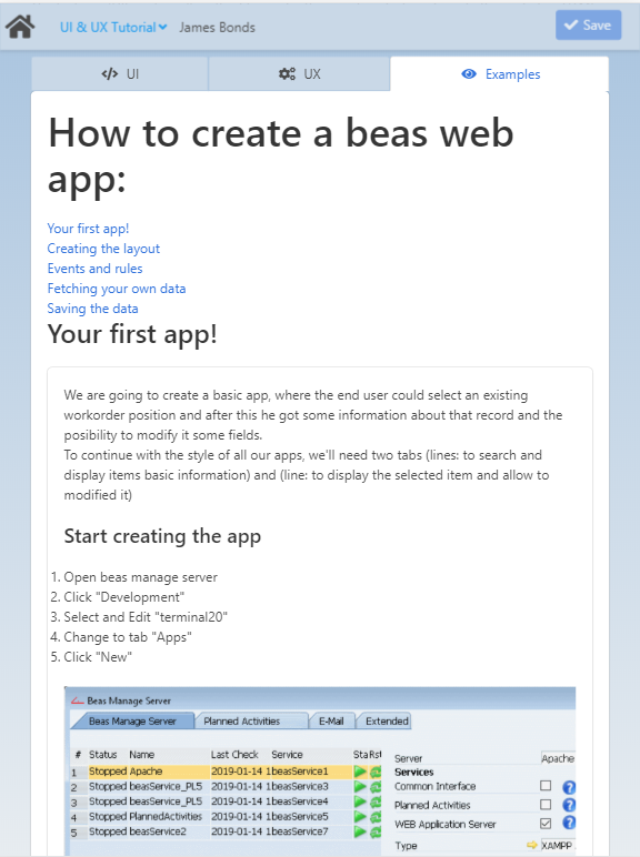
In this tab you can learn how to create a basic app with step-by-step instructions.
Step of creating an app
|
Description/Code
|
Your first app!
|
 Start creating the app Start creating the app
1.Open Beas manage server
2.Click "Development"
3.Select and Edit "terminal20"
4.Change to tab "Apps"
5.Click "New"
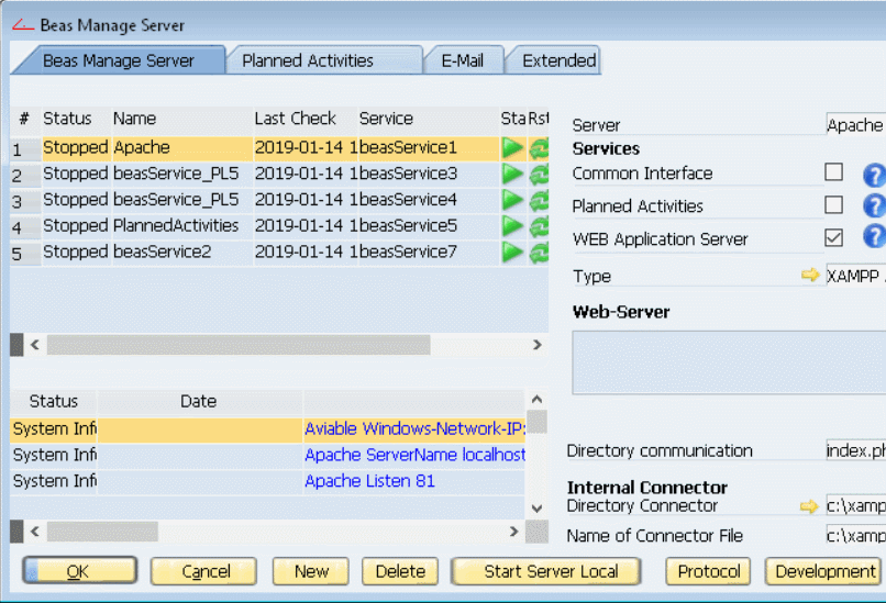
Defining the basic settings:
1.All not standard apps should start with the prefix "mod_"
Set the long "Description" and the title "Menu Text" for this app
Set the "ID" as (1) the "App Name"
2.Set the icon for this app (we should create the folder and put the icon there)
3.Uncheck the "None Update" option to save this app to file
4.Check that the folder is writable
Finally add this code, and save it.
_header()
gui()
_footer()
return success
// -----------------------------------------------------------------------------------------
function gui
[html]
<script src="assets21/apps/mod_sample01/i18n/@currentlanguage@.js"></script>
<script src="assets21/apps/mod_sample01/app.js"></script>
[/html]
end function
// -----------------------------------------------------------------------------------------
The _header() and _footer() will load the standard header and footer for our application.
The first script, should contain the translations for the @currentlanguage@.
And the second script is the apps itself.
The next step should be create the folder assets21/apps/mod_sample01 and inside of this folder the files "app.png" (the app icon) and "app.js", and optionally "i18n/XX.js" where XX is the language to translate the app to (EX. ES=Spanish, FR=French, E=English).
|
|
Creating the layout
|
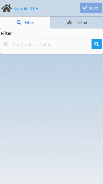
We want to create two tabs (Filter/Detail).
The tab filter contains a field to search/filter by (WorkOrderID/Positon) or (Produced ItemCode/ItemName) + a button to execute the action.
Also the result for such filter will be displayed below this field.
If the user clicks on any result, we want to jump to the second tab (Detail), which will display some details about that work order and the possibility to modify the fields "Description" and/or "Info".
Edit the file app.js and add the basic code:
class customAPP {
constructor() {
this.gui();
}
gui() {
// Create the APP UI Template___________________________________________________________________
var ui = new UI;
// Using the UI.js library we create an input field and the container for a data grid
var tabFilter = ui.input( _t("Filter"), "filter", "", {licon:"fa-cube",rbutton:"fa-search", autofocus:true, placeholder:_t("Item Code or Name"), error:_t("Please select an item")} ) +
ui.dgrid("dgFilterResult");
// We define later the content for the second tab
var tabDetail = ui.box('later we will put details about the selected item here',{id:"itemDetail"}) +
ui.input( _t("Description"), "description", "", {licon:"fa-asterisk"} ) +
ui.textarea( _t("info"), "info", "", {licon:"fa-info"} )
;
// Now we create the "Tab" container and set for each tab the layout defined in the previous lines
var html = ui.tabs( "MApp",
[
{icon:ui.fa("search"), title:_t("Filter"), active:true, content:tabFilter, id:"tabFilter"},
{icon:ui.fa("cubes"), title:_t("Detail"), content:tabDetail, id:"tabDetail"}
]
);
// Finally we render the app into the app container
document.getElementById("app-container").innerHTML = html;
// Start by initializing all tabs controls
ux.tabs('MApp', 'init');
}
}
var app = new customAPP;
|
Events and rules
|
constructor() {
this.appData_clear();
this.gui();
}
appData_clear() {
// We clear all appData we stored previously
this.appData = { woID:0, woPosition:0, itemCode:'', itemName:'', quantity:0, description:'', info:'' };
}
gui() {
// ... at the bottom
// Apply the UX _____________________________________________________________________________
// All previous steps define only static content, now we are use the UX.js to bring to live these controls
// Listen for a changing event in the control MApp, we want to prevent that user change to the second tab if nothing has been selected
ux.listen( 'changing',
'MApp',
function (e) {
switch(e.detail.targetTab) {
case "tabFilter":
break;
case "tabDetail":
if ( this.appData.woID>0 ) this.displayDetail();
else e.preventDefault();
break;
}
}.bind(this)
);
// TAB FILTER___________________________________________________________________________
// Listen for a click event in the button on the right side of the control filter (magnify icon) to trigger the filter function
ux.listen( 'click',
'filter-rbutton',
function(e) {
this.filter(document.getElementsByName("filter")[0].value);
}.bind(this)
);
// Listen for a change event in the field "filter", and trigger the filter function
ux.listen( 'change',
'filter',
function (e) {
this.filter( document.getElementsByName("filter")[0].value );
}.bind(this)
);
// Prepare the data grid container with a valid and empty grid (We define fields, default sort, and action after user click on one line)
ux.dgrid( 'dgFilterResult',
{
fields:[{title:_t('WO/Position'), sort_key:'id'},{title:_t("Item No"), sort_key:'ItemCode'},{title:_t('Qty')}],
url:'',
sort_key:'id', sort_dir:'ASC',
onclick_row:this.filter_onclick_row.bind(this)
}
);
// Add autocomplete to some fields...
ux.autocomplete( 'filter', '?get=wo&q=*q*' ); // Url to beascript backend to retrieve information
// TAB Detail___________________________________________________________________________
// Listen for a change event in the field "info", and save the data
ux.listen( 'change',
'info',
function (e) {
this.appData.info = document.getElementsByName("info")[0].value;
this.checkDetail();
}.bind(this)
);
ux.listen( 'change',
'description',
function (e) {
this.appData.description = document.getElementsByName("description")[0].value;
this.checkDetail();
}.bind(this)
);
}
// Get all the workorders filtered by the given keyword
filter(keyword) {
// If the autocomplete is working in this control, then do nothing to avoid duplicated actions
if ( document.getElementsByName("filter")[0].getAttribute("autocomplete-active") == 'true' ) return;
// Get the grid control handler
let dg = ux.dgrid('dgFilterResult');
// Set the new URL (filter by the current control content "keyword")
dg.url = "?get=wo&q="+encodeURIComponent(keyword); // Call to beascript backend to retrieve information
// Force to reload the page 1
dg.page(1);
}
// User selected a row from the filtered table
filter_onclick_row(d,rid) {
console.log("JDG :: Row clicked > ",d);
this.getDetails(d[0]);
}
getDetails(woIDPos) {
console.log("JDG :: Getting information about WO ("+woIDPos+")");
let url = '?get=detail&woIDPos='+encodeURIComponent(id);
ux.aget( url,
function(err, result) {
// These are the defaults value, just in case we don't retrieve some value
let d = { woID:0,woPosition:0, itemCode:'', itemName:'', quantity:0, description:'', info:'' };
let r = this.currentLine;
if (!err && result.hasOwnProperty("value")) {
// Merge the retrieved values with the defaults one
if (result.value.length>0) {
let v = result.value[0];
let i = -1;
d.woID = +v[++i];
d.woPosition = +v[++i];
d.itemCode = v[++i];
d.itemName = v[++i]||'';
d.quantity = +v[++i];
d.description = v[++i];
d.info = v[++i];
}
}
// Store in the "appData" variable, the information
console.log("JDG :: itemcode("+id+")",d);
this.appData.woID = d.woID;
this.appData.woPosition = d.woPosition;
this.appData.itemCode = d.itemCode;
this.appData.itemName = d.itemName;
this.appData.quantity = d.quantity;
this.appData.description = d.description||'';
this.appData.info = d.info||'';
// Finally, change to tabDetail
ux.tabs('MApp', 'active', 'tabDetail');
}.bind(this)
);
}
displayDetail() {
ux.getElement("woDetail").innerHTML = _t("Work Order: ")+this.appData.woID+
'
'+ _t("Position: ")+this.appData.woPosition+
'
'+ _t("ItemCode: ")+this.appData.itemCode+
'
'+ _t("ItemName: ")+this.appData.itemName+
'
'+ _t("Quantity: ")+this.appData.quantity;
ux.getElement("description").value = this.appData.description;
ux.getElement("info").value = this.appData.info;
ux.set("info", "subtitle", "(write more than 15chars)");
return this.checkDetail();
}
// Validation rules: Description and info cannot be empty and for the info you need to write more than 15 characters...
checkDetail() {
let has_error = false;
ux.set('description', 'clear');
if ( this.appData.description == '' ) { has_error = true; ux.set('description', 'error'); }
ux.set('info', 'clear');
if ( this.appData.info.length < 15 ) { has_error = true; ux.set('info', 'error'); }
// Inform to the framework if the app can save or not the data
if ( has_error ) ux.set("appSave","disabled"); else ux.set("appSave","enable");
return has_error;
}
|
Fetching your own data
|
You should use Beas Service Layer (BSL) and oData to request information but if you need request custom data then we can use beasScript to deliver them.
In our example, we need two sort of request: (1) A List of work orders (2) The detail for the selected work order.
Open the app in Beas manage server > development > terminal20:[apps] > mod_sample01 and add the next piece of code at the beginning:
// -----------------------------------------------------------------------------------------
if = 'wo' then
shtml.web.responseType=json
getWorkOrderList()
return
end if
if = 'detail' then
shtml.web.responseType=json
getWorkOrderDetail()
return
end if
// -----------------------------------------------------------------------------------------
// -----------------------------------------------------------------------------------------
function getWorkOrderList
setvar=al_limit=
setvar=page=
setvar=qLike=%%
if in {woIdPos,ItemCode} then
// ...
else
setvar=sort_by=woIdPos
setvar=sort_dir=ASC
end if
if in {desc,asc} then
// ...
else
setvar=sort_dir=ASC
end if
setvar=ls_sql= cast("BELNR_ID" as varchar)||'/'||cast("BELPOS_ID" as varchar) as "woIdPos", "ItemCode", "MENGE" from "BEAS_FTPOS" &
where = '' or (cast("BELNR_ID" as varchar)||'/'||cast("BELPOS_ID" as varchar)) like or "ItemCode" like &
ORDER BY ""
shtml.web.dgrid=sql,
,,select
end function
// -----------------------------------------------------------------------------------------
function getWorkOrderDetail
setvar=ls_sql= p."BELNR_ID", p."BELPOS_ID", p."ItemCode", i."ItemName", p."MENGE", p."ItemName" description, p.zusatztext info from "BEAS_FTPOS" p inner join "OITM" i on (i."ItemCode"=p."ItemCode") &
where (cast("BELNR_ID" as varchar)||'/'||cast("BELPOS_ID" as varchar)) =
shtml.web.dgrid=sql,1,1,select
end function
// -----------------------------------------------------------------------------------------
|
Saving the data
|
Saving the data has three parts:
(1) The part where we prepare the data and send to some backend (beasScript in this example),
(2) The backend to process and save those data,
(3) and finally check the answer from the backend and display the result to the user or prepare the app for a new transaction.
|
|
The "Overview" header is visible on the top for all three tabs. In each tab, you can see the list of contents linked to the given topic on top (see images above).
Therefore, you can have a quick overview of the whole tab content and easily access the chapter of your interest.
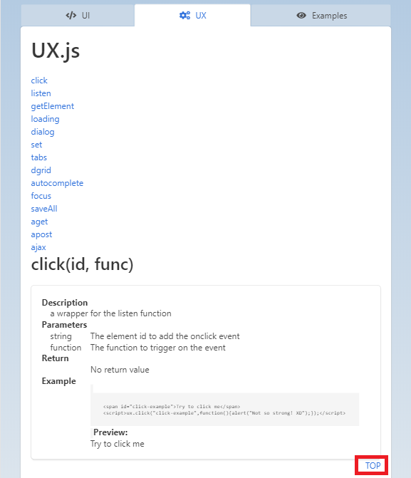
At the end of each topic you can jump back to the top using the "TOP" button located bottom right under the frame of the chapter (see image in UX above).
As the app serves informational purposes, the "Save" button has not function and remains inactive.
Help URL: https://help.beascloud.com/beas202304/index.html?ui__ux_tutorial.htm
|