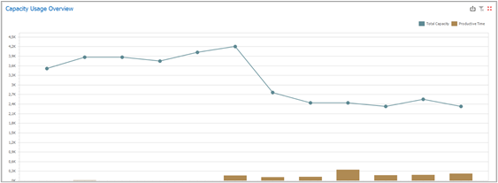
This chart compares two pieces of information: the total capacity and the total productive usage of the capacity for each month (productive times = scheduled work + executed work, setups are not considered as productive times). The total capacity is displayed as a dotted line, while the productive usage of the capacity is displayed as bars for each month.
Any month can be selected for further insights on how the capacities are or were used (triggering filters on the other reports and charts from the dashboard).