Topic
|
Method
|
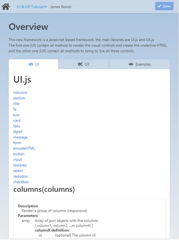
columns
|
Description
|
Render a group of columns (responsive).
|
Parameters
|
array
|
Array of json objects with the columns:
[ column1, column2, ...m columnN ]
columnX definition:
ID
|
(optional) The column ID
|
size
|
Size for this column. Available sizes are: 3/4, 2/3, 1/2, 1/3, 1/4, 4/5, 3/5, 2/5, 1/5
|
content
|
The column content
|
|
Return
|
string
|
The HTML to create the columns
|
Example
|
|
> ui.columns( [{size:"1/5",content:"This columns should be 1/5 of the size. (Or all width in a mobile)"},
{size:"3/5",content:"This columns should be 3/5 of the size. (Or all width in a mobile)"},
{size:"1/5", content:"This columns should be 1/5 of the size. (Or all width in a mobile)"}] );
|
Preview:
In the preview of the example you can see how the above string can modify the size of the columns.
|
|
section
|
Description
|
A simple container to divide your page into sections.
|
Parameters
|
string
|
The HTML content
|
object
|
json object with the options:
ID
|
(optional) The control ID
|
hero
|
The section is a hero. (true|false)
|
|
Return
|
string
|
The HTML to create the section
|
Example
|
|
> ui.section( "Put here the content" );
Preview:
In the preview of the example you can see the result of the string:
"Insert content here."
|
|
|
title
|
Description
|
Create a title/subtitle (title/subtitle).
|
Parameters
|
string
|
The HTML content
|
object
|
json object with the options:
type
|
Type of title: (title|subtitle)
|
size
|
The size: (1,2,3,4,5,6,7,8)
|
|
Return
|
string
|
The HTML to render the title
|
Example
|
|
> ui.title( "This is a title" );
Preview:
In the preview of the example you can see the result of the string:
"This is a title."
|
|
|
fa
|
Description
|
Render the HTML to represent a font-aweson icon.
|
Parameters
|
string
|
The icon name (check names here: https://fontawesome.com/icons?d=gallery )
|
string
|
(optional, default:"small") The icon size: small, medium, large, 2x, 3x
|
Return
|
string
|
The HTML to create the icon
|
Example
|
|
> ui.fa( "smile-wink" );
< <span class="icon"><i class="fas fa-smile-wink"><></span>
Preview:
In the preview of the example you can see the result of the string, a wink icon:

|
|
|
box
|
Description
|
A simple box.
|
Parameters
|
string
|
The HTML content
|
object
|
JSON object with the options
ID
|
(optional) The ID for this tab
|
|
Return
|
string
|
The HTML to render the control
|
Example
|
|
> ui.box( "This is the box's content" );
Preview:
In the preview of the example you can see the result of the string:
This is the content of the box.
|
|
|
|
card
|
Description
|
The card component comprises several elements:
| • | header title, subtitle, icon, image |
| • | content (at this moment all your output after command header until a footer command is executed) |
|
Parameters
|
object
|
JSON object with the options
title
|
The tab title
|
subtitle
|
The tab subtitle
|
img1
|
The image next to the title
|
img2
|
The image next to the content
|
content
|
The tab content
|
buttons
|
Array ob json objects with the buttons definition:
title
|
The button title
|
link
|
A link for the button
|
onclick
|
JS to execute onclick
|
|
|
Return
|
string
|
The HTML to render the control
|
Example
|
|
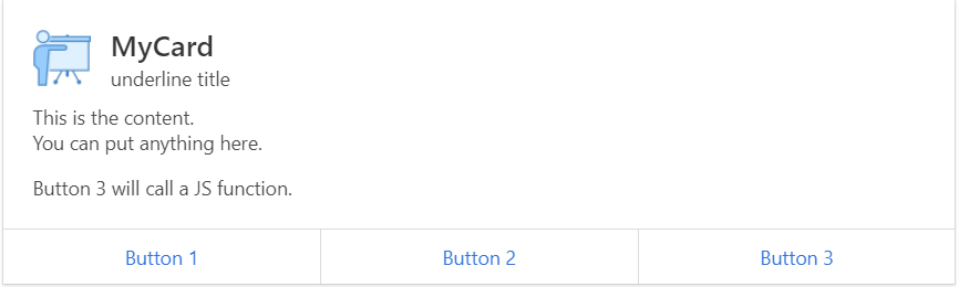
> ui.card( { title:"MyCard",subtitle:"underline title",img1:"assets21/img/app_t20_demo.png", content:"
This is the content.
You can put anything here.
Button 3 will call a JS function.
", buttons:[ {title:"Button 1",link:"#"},{title:"Button 2",link:"#"},{title:"Button 3",link:"", onclick:"alert('JDG::JS-test')"}] });
Preview:
In the preview of the example you can see the result of the string:
|
|
|
tabs
|
Description
|
Create a tab control.
|
Parameters
|
string
|
The tab ID
|
array
|
An array of json objects with all options to render each tab:
[ tab1, tab2, ..., tabN ]
tabX structure:
ID
|
(optional) The ID for this tab
|
title
|
The tab title
|
icon
|
The tab icon (You can use ui.fa() to render the icon)
|
content
|
The tab content
|
|
Return
|
string
|
The HTML to create the tab
|
Example
|
|
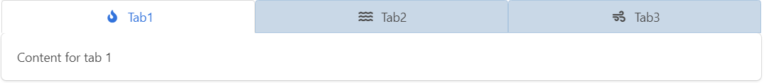
> ui.tabs( "tabExample01", [ {title:"Tab1", icon:ui.fa("fire"), content:"Content for tab 1"},
{title:"Tab2", icon:ui.fa("water")}, {title:"Tab3", icon:ui.fa("wind")}] );
Preview:
In the preview of the example you can see the result of the string:
|
|
|
dgrid
|
Description
|
Create the container to hold a DataGrid.
|
Parameters
|
string
|
The control id
|
Return
|
string
|
The html to contain the control created by the UX library
|
Example
|
|
> ui.dgrid( "gridExample01" );
Preview:
In the preview of the example you can see the result of the string.
|
|
|
message
|
Description
|
Create a message box.
|
Parameters
|
number
|
The error code. If it is lower than 0 is considered an error
|
string
|
The HTML with the message
|
Return
|
string
|
The HTML to create the control
|
Example
|
|
> ui.message( -1, "Ups. This is an error box!" );
|
|
|
form
|
Description
|
Render the html to represent a form.
|
Parameters
|
string
|
The form ID
|
string
|
The action to perform when you submit the form
|
string
|
The content
|
Return
|
string
|
The HTML to create the form
|
Example
|
|
> ui.form( "formExample", "?page=myApp", html_with_the_content );
<
html_with_the_content
|
|
|
encodeHTML
|
Description
Encode a string to be used as value in a HTML tag.
Parameters
string The string to be encoded.
Return
void
Example
> ui.encodeHTML( "This & this " );
< This & this <is a test>
|
|
button
|
Description
|
Render the HTML to represent a button.
|
Parameters
|
string
|
The control ID
|
string
|
The title of the control
|
options
|
json object with all options to render the control:
link
|
Define the target URL for this button
|
type
|
Define the type applied to the button
|
licon
|
Define the left icon displayed into the button (You can use a fontaweson name)
|
readonly
|
Define the control as read-only
|
disabled
|
Define the control as disabled
|
|
Return
|
string
|
The HTML to create the control
|
Example
|
|
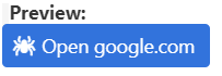
> ui.button( "buttonExample01", "Open google.com", {type:"is-link", link:"https://www.google.com", licon:"spider"} );
Preview:
In the preview of the example you can see the result of the string:
|
|
|
input
|
Description
|
Render the HTML to represent an input box.
|
Parameters
|
string
|
The control's label
|
string
|
The control's name
|
string
|
The control's default value
|
options
|
json object with all options to render the control:
type
|
Define the type of the input box, default is text. (hidden|text|number|date)
|
placeholder
|
Define the placeholder for the input, by default the control's tittle is used to.
|
licon
|
Define the left icon displayed into the button (You can use a fontawesome name)
|
ricon
|
Define the right icon displayed into the button (You can use a fontawesome name)
|
lbutton
|
The field has an action button at the left side like an option icon
|
rbutton
|
The field has an action button at the right side like a search icon
|
readonly
|
Define the control as read-only
|
disabled
|
Define the control as disabled
|
error
|
Error if the user has selected nothing
|
|
Return
|
string
|
The HTML to create the control
|
Example
|
|
> ui.input( "User Name", "name", "", {placeholder:"Type your name", licon:"fa-user", rbutton:"fa-search" } );
Preview:
In the preview of the example you can see the result of the string:

|
|
|
textarea
|
Description
|
Render the HTML to represent an text area box.
|
Parameters
|
string
|
The control's label
|
string
|
The control's name
|
string
|
The control's default value
|
options
|
json object with all options to render the control:
placeholder
|
Define the placeholder for the input, by default the control's tittle is used to.
|
readonly
|
Define the control as read-only
|
disabled
|
Define the control as disabled
|
error
|
Error if the user has selected nothing
|
|
Return
|
string
|
The HTML to create the control
|
Example
|
|
> ui.textarea( "Remarks", "notes", "", {placeholder:"Type your notes"} );
Preview:
In the preview of the example you can see the result of the string:
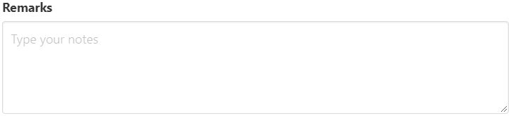
|
|
|
select
|
Description
|
Render the HTML to represent an select box (dropdown).
|
Parameters
|
string
|
The control's label
|
string
|
The control's name
|
string
|
The control's default value
|
array
|
[ [key1,value1], ..., [keyN,valueN] ]
|
options
|
json object with all options to render the control:
licon
|
Define the left icon displayed into the button (You can use a fontawesome name with the prefix "fa-")
|
readonly
|
Define the control as read-only
|
disabled
|
Define the control as disabled
|
error
|
Error if the user has selected nothing
|
|
Return
|
string
|
The HTML to create the control
|
Example
|
|
> ui.select( "Choose an option", "select-example", "", [[1,"Option 1"],[2,"Option 2"],[3,"Option 3"]], {licon:"fa-bolt"} );
Preview:
In the preview of the example you can see the result of the string:

|
|
|
radiobox
|
Description
|
Render the HTML to represent a group of excluding options (radio-box).
|
Parameters
|
string
|
The control's name
|
string
|
The control's default value
|
array
|
[ [key1,value1], ..., [keyN,valueN] ]
|
options
|
json object with all options to render the control:
readonly
|
Define the control as read-only
|
disabled
|
Define the control as disabled
|
|
Return
|
string
|
The HTML to create the control
|
Example
|
|
> ui.radiobox( "radiobox-example", "", [[1,"Option 1"],[2,"Option 2"],[3,"Option 3"]], {licon:"fa-bolt"} );
Preview:

|
|
|
checkbox
|
Description
|
Render the HTML to represent a group of options (check box).
|
Parameters
|
string
|
The control's name
|
string
|
The control's default value
|
array
|
[ [key1,value1], ..., [keyN,valueN] ]
|
options
|
json object with all options to render the control:
readonly
|
Define the control as read-only
|
disabled
|
Define the control as disabled
|
|
Return
|
string
|
The html to create the control
|
Example
|
|
> ui.checkbox( "Do you like our new framework?", "checkbox-example", true );
Preview:
In the preview of the example you can see the result of the string:

|
|
|
more
|
Description
|
Render a line with more information collapsed.
|
Parameters
|
string
|
The title of the control
|
string
|
The content of the control
|
Return
|
string
|
The html to create the control
|
Example
|
|
> ui.more( "Click here to expand the information", "This is the information
inside of this control
Hello!!" );
Preview:
In the preview of the example you can see the result of the string - a link appears:
Click here to expand the information
- By clicking the link in the app, you can test how the information is expanded. You can close the displayed message box by tapping the "Close" button in the right top corner of the box.
|
|
|
