PATH: Administration > Add-Ons > B1 Usability Package > Module configuration > Beas usability extension > New Edit Item button.
Configurations of window layout can be changed by using the Item Placement Tool
The Edit Item Placement Tool configuration window consists of three main sections:
Top section: Serves as a definition of the environment.
Bottom left section: Lists the changed fields of the given window.
Right window section: Editable properties of the fields listed on the left.
Window sys_itemreplacement_edit.psr
See  Overview
The Item Placement Tool can be accessed in the following ways:
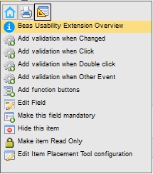
- Ctrl + double-click on a field which should be edited. - Right-click, select the tab with the beas Usability Package Icon
Choose the Item Placement Tool configuration you would like to work on by double-clicking on the line, or by highlighting the line and clicking on the edit button.
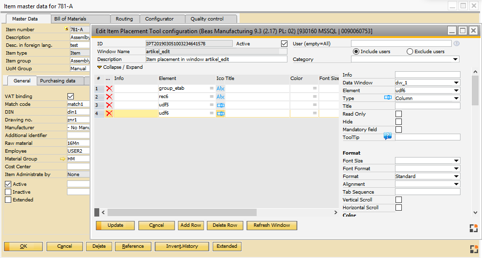
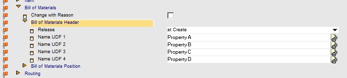
The window to be edited should not be closed while being edited in the Item Placement Tool. The field to be edited is marked with a "frame" and is highlighted in the Item Placement Tool (line 4 in this example) and the details of this field are displayed to the right of it.
The window to be edited is displayed with a yellow background which indicates that it is in "edit mode" (See image above) If a setting is changed in the Item Placement Tool this is immediately visible in the original window. Unfortunately, an automatic preview is not possible. To create the correct result, click "Refresh window". In the original window the default color is displayed and can be edited and checked normally. When clicking on the Item Placement Tool window, it will automatically come into focus and the original window automatically returns to "edit mode".
Move Field
Change the mode to "edit mode" (yellow background) in order to move a field. Click on the corresponding field and hold the left mouse button. Drag the field to the desired position while holding down the left mouse key. If the field is to be positioned below an already existing field, simply drag the field into the existing field and it will automatically be positioned below. You can add and edit an extensive list of properties of a given field in the right window section of the Item placement configuration window.
User Defined Fields (UDF)
Unlike in SAP Business One it is not possible to define one's own UDF's in Beas. However, in most windows UDF1 to UDF4 of the type: "string" are available, furthermore also UDF5 to UDF15 e.g. in Bill of Materials, work plan, article version, and many others.
Special feature UDF1 .. UDF4 These are defined in the setup wizard and are immediately active and correctly positioned in all corresponding windows. UDF1-4 are area-related and not window-related e.g. Routing Position: These are relevant for "Routing Catalog", "Routing" (List and edit window), Work order routing plan (List and edit window), as well as Precalculation. Formatting and definition of further properties is done directly via the setup wizard and also stored in the setup wizard. Definition of user dependencies is not possible.
Example: Configuration Wizard > Bill of Materials > Definition UDF1–4
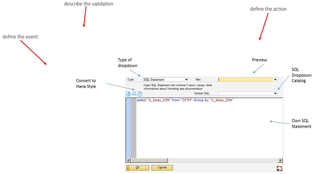
Utilization UDF 5–15 If UDF 5 to UDF 15 are available in a window, they can be added via the Item Placement Tool. These are always of the type "String" but their properties can always be changed in the field "Format" to the types Decimal or Date. However, they are always saved as a string.
A UDF is added in the following way: 1. Click on "Line Add" 2. Select the corresponding UDF from the field "Element". This can be named UDF5 or <tablename>_UDF5, e.g. BEAS_STL_HEADER_UDF5 3. Select Type "Column" 4. Select "Title" and "Format" 5. Click on "Rebuild" 6. The field is now at the top left. It can now be moved with the mouse to the correct position 7. Define and save other properties
Using template fields In some windows Templatefield1 .... Templatefieldx are available. These sometimes have different lengths and types. These fields are not linked to the database and can be used for a wide variety of purposes. They can be integrated in the same way as UDF fields. However, loading and saving must be defined individually. This can be done via Validation Configuration – Event: select "Form Load" / "Form Add" / "Form Updated" from the drop-down.
User-Dependent Definition There can be more than one configuration, e.g. user-dependent go to: User All configurations that fall under the user rule and are active are always considered here.
If more than one definition exist, they must be opened via Right-click – beas Usability Package – Integration Icon
|
A configuration is linked to a window. You can define more than one configuration for a window. A definition can be e.g. user-dependent.
•B1UP license is required. •Only Beas windows can be changed. Beas windows can always be recognized by the Beas logo •The UDF fields 1–4 cannot be changed here. •Windows of the type "List" or "Structure" cannot be customized .
|
 in the bottom right corner.
Field descriptions of the Edit item Placement Tool
Header:
Field |
Description |
|
|---|---|---|
ID |
Unique ID for the Configuration – Definition. If an ID is not set manually the system assigns one automatically. |
|
Window ID |
ID of the window for which the defined changes should apply. Tip: The window specified here must be open in order to change its properties. |
|
Description |
Text field where the configuration can be described in further detail. |
|
Active |
The configuration is only considered if the field is active. |
|
User (empty = All) |
|
|
Category |
Defines the category. Configuration groups can also be defined here. |
Field Description for further properties
Field |
Available for |
Description |
|||||||||||||||||||||
|---|---|---|---|---|---|---|---|---|---|---|---|---|---|---|---|---|---|---|---|---|---|---|---|
Info |
All |
Optional information or remarks. |
|||||||||||||||||||||
Data Window |
All |
DataWindow where the field is located (dw_1 .. dw_7). |
|||||||||||||||||||||
Element |
All |
|
|||||||||||||||||||||
Type |
All |
Field type: Text Field, Input Field (Column), Form Field (Compute), Picture (Bitmap), or Button. |
|||||||||||||||||||||
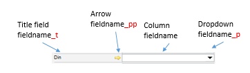
Title |
Column |
|
|||||||||||||||||||||
Font Size |
All |
Defines the font size: very small – small – normal – large – very large. |
|||||||||||||||||||||
Font Format |
All |
Defines font format: normal, bold, italic, bold and italic |
|||||||||||||||||||||
Read Only |
Column |
||||||||||||||||||||||
Hide |
All |
||||||||||||||||||||||
Column |
If active, an entry in this field is mandatory. Otherwise, any kind of change or addition is blocked. |
||||||||||||||||||||||
Focus ALT + |
Column |
If a letter has been saved, the field can be accessed directly via: "ALT" + the given letter (Hotkey). |
|||||||||||||||||||||
Tooltip |
All |
If a text is specified here, it is displayed as a tooltip in this field. |
|||||||||||||||||||||
Bitmap |
Bitmap |
Icon to be displayed. |
|||||||||||||||||||||
Format |
Column, Compute |
||||||||||||||||||||||
Alignment |
Column, Compute, Text, Button |
Determines the alignment of the text or the content: Left, Right, or Centered. |
|||||||||||||||||||||
TAB Sequence |
Column |
Determines the TAB order. |
|||||||||||||||||||||
V Scrollbar |
Column |
Enables vertical scroll, automatically scrolls down to the next line if the end of the line is reached by the cursor. |
|||||||||||||||||||||
H Scrollbar |
Column |
Enables horizontal scroll; if the cursor reaches the right side of the column, the text will automatically be shifted to the right and the additional letters can be added. |
|||||||||||||||||||||
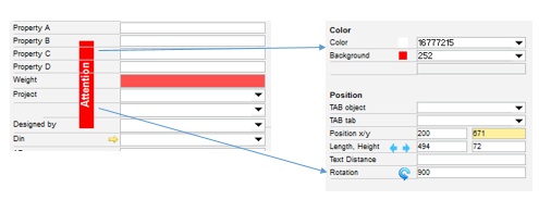
Color |
All |
Determines the color of the field. |
|||||||||||||||||||||
Background |
Text, Column, Compute |
Determines the background of the field. |
|||||||||||||||||||||
Error Color |
Column |
Determines the background of the field if the content contains errors. |
|||||||||||||||||||||
Empty Color |
Column |
Determines the background of the field when the field is empty and when an input is mandatory. |
|||||||||||||||||||||
Tab Object |
All |
Determines the name of the TAB Object . Here you can select the tab object in which the field should be located. If the field is moved to a tab area using drag & drop the field are filled automatically. |
|||||||||||||||||||||
TAB tab |
All |
Determines the name of the TAB tab of the tab object selected in "Tab object". |
|||||||||||||||||||||
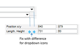
Position x/y |
All |
|
|||||||||||||||||||||
Length, Height |
All |
|
|||||||||||||||||||||
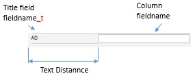
Text Distance |
Column |
|
|||||||||||||||||||||
Rotation |
All |
|
|||||||||||||||||||||
Dropdown |
Column |
|
|||||||||||||||||||||
Golden Arrow |
Column |
If a script has been stored, a golden arrow will be displayed to the left of the input field. If the golden arrow is clicked, the script stored here will be executed. |
|||||||||||||||||||||
Click |
All |
A script can be saved here. It will be executed when clicking on the field. |
|||||||||||||||||||||
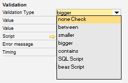
Validation Type Value |
Column |
|
|||||||||||||||||||||
Script |
Column |
If beas script or SQL script is selected in the validation, then the respective script can be defined here. |
|||||||||||||||||||||
Error Message |
Column |
Defines the message which should appear in case of an error . |
|||||||||||||||||||||
Timing |
Column |
|
 Go to: