Actual use vs Capacity in the last 3 months by resource groups
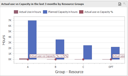
This graph displays the total hours of resource utilization, the hours of the total planned capacity, and the percentage of the actual resource utilization out of the total planned capacity. The values are presented by resource groups.
This indicator includes by default the last 3 months as the data range, active resources only with capacity planning and it excludes the resources set for service or cost.
Drill down: It is possible to see the resources that belong to each group by clicking on the values for the specific group.
Data Items used |
Description |
View/Table field |
Planned Capacity |
Total hours of the planned capacity in the last 3 months. |
View: "BEASV_RESOURCE_UTILIZATION"."PlannedCapacity" |
Actual Use |
Total hours of the actual use in the last 3 months. |
View: "BEASV_RESOURCE_UTILIZATION"."ActualUtilization" |
Resource group |
Resource group name. |
View: "BEASV_RESOURCE_UTILIZATION"."ResourceGroup" |
Resource name |
Resource name that is displayed after drilling down. |
View: "BEASV_RESOURCE_UTILIZATION"."NAME" |
Actual use vs Capacity in the last 3 months by Resources
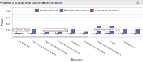
This graph shows the total hours of resource utilization, the hours of the total planned capacity, and the percentage of the actual resource utilization out of the total planned capacity. The values are presented by individual resources.
This indicator includes by default the last 3 months as the data range, active resources only with capacity planning and it excludes the resources set for service or cost.
Data Items used |
Description |
View/Table field |
Planned Capacity |
Total hours of the planned capacity in the last 3 months. |
View: "BEASV_RESOURCE_UTILIZATION"."PlannedCapacity" |
Actual Use |
Total hours of the actual use in the last 3 months. |
View: "BEASV_RESOURCE_UTILIZATION"."ActualUtilization" |
Resource name |
Resource name. |
View: "BEASV_RESOURCE_UTILIZATION"."NAME" |
Actual use vs Capacity in the last 12 months (by months)
The following example uses a database which contains data for the past three months only. A complete database would show a graph with the last 12 months and their values.
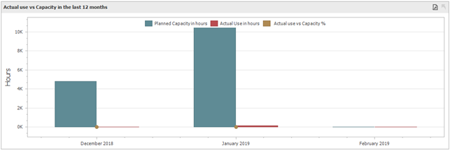
This graph shows the total hours of the resource utilization, the hours of the total planned capacity, and the percentage of the actual resource utilization out of the total planned capacity. The values are presented by month.
This indicator includes by default the last 12 months as the data range, active resources only with capacity planning and it excludes the resources set for service or cost.
Drill down: It is possible to see the resources that belong to each month by clicking on the values for the specific month.
Data Items used |
Description |
View/Table field |
Planned Capacity |
Total hours of the planned capacity in the last 12 months. |
View: "BEASV_RESOURCE_UTILIZATION"."PlannedCapacity" |
Actual Use |
Total hours of the actual use in the last 12 months. |
View: "BEASV_RESOURCE_UTILIZATION"."ActualUtilization" |
Date |
Capacity planning date used as an argument. It includes only the dates in the last 10 months. |
View: "BEASV_RESOURCE_UTILIZATION"."Date" |
Resource name |
Resource name used as an argument. It is shown after drilling down. |
View: "BEASV_RESOURCE_UTILIZATION"."NAME" |